Client: Edge On The Square
Agency: Chen Design Associates
Year: 2022
Lead Design: Thavin Rajanakhan
Project Manager: Becky Luoh
Creative Director: Josh Chen
What:
Edge on the Square is a project of Chinatown Media & Arts Collaborative, an unprecedented coalition of six SF-established AAPI institutions. Its leaders entrusted us to create a new brand identity system rooted in the ambitious enterprise’s origins and aims to represent the community for years to come. Our work would help give shape to aspirational architectural plans and be able to skillfully present other artists’ work while establishing its own distinct brand in the SF arts and culture ecosystem and beyond.
How:
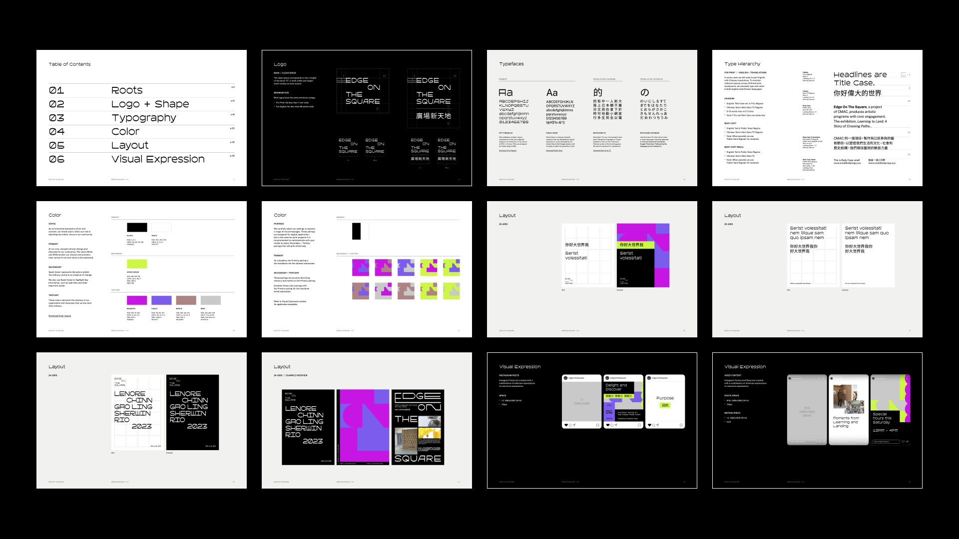
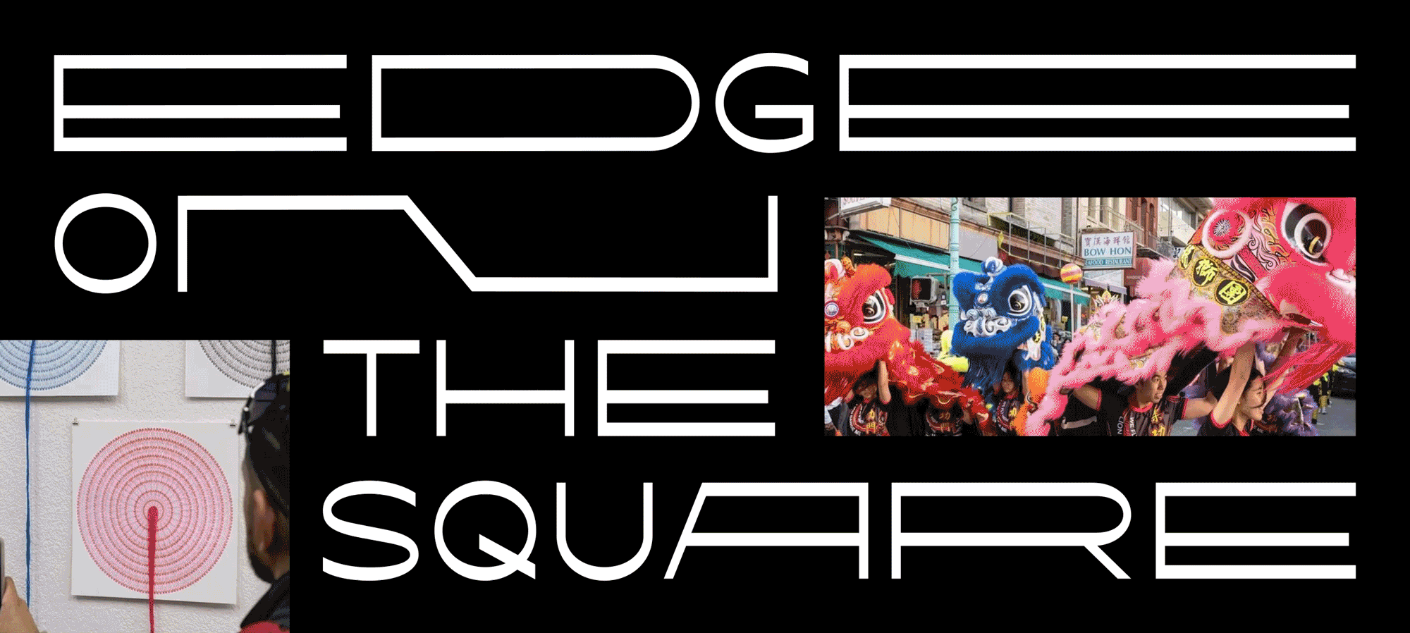
Embodying an ethos of elasticity with letters stretching and contracting, the new logo expresses the tension and coming together over unconventional art and immigrant storytelling. It also reflects living, ever-changing media, programs, and conversations, making the logo a dynamically flexible frame for the work of diverse guest artists while standing on its own, in English and in Chinese.
Agency: Chen Design Associates
Year: 2022
Lead Design: Thavin Rajanakhan
Project Manager: Becky Luoh
Creative Director: Josh Chen
What:
Edge on the Square is a project of Chinatown Media & Arts Collaborative, an unprecedented coalition of six SF-established AAPI institutions. Its leaders entrusted us to create a new brand identity system rooted in the ambitious enterprise’s origins and aims to represent the community for years to come. Our work would help give shape to aspirational architectural plans and be able to skillfully present other artists’ work while establishing its own distinct brand in the SF arts and culture ecosystem and beyond.
How:
Embodying an ethos of elasticity with letters stretching and contracting, the new logo expresses the tension and coming together over unconventional art and immigrant storytelling. It also reflects living, ever-changing media, programs, and conversations, making the logo a dynamically flexible frame for the work of diverse guest artists while standing on its own, in English and in Chinese.


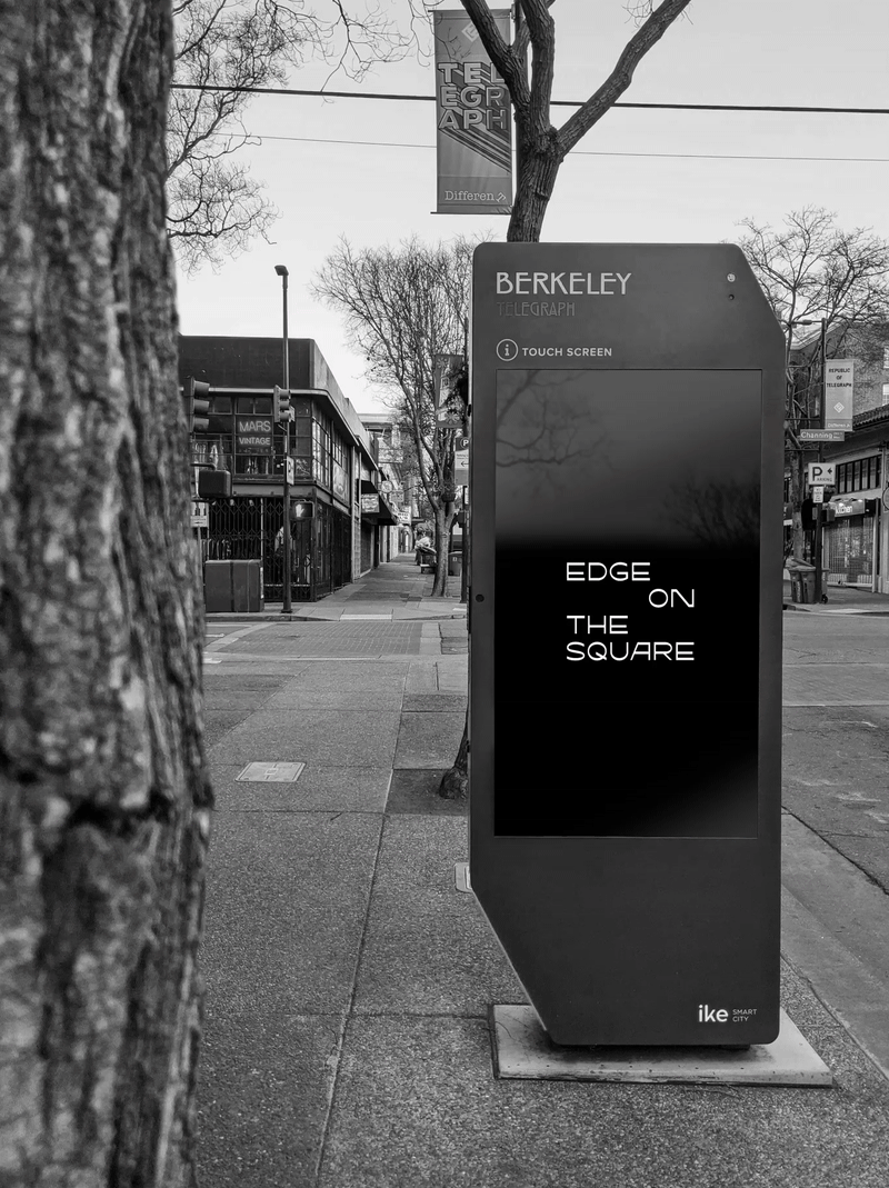

For the main typeface, we resonated with the letter forms and sensibilities of Asian American type designer, Heejae Yang. It was also important for us to infuse the primary black and white palette with unexpected supporting colors in electric, punk-inspired combinations. These infuse a vitality and interesting visual range for printed and digital marketing collateral. We provided a brand toolkit and guidelines that provide the foundation for in-house designers to carry the brand into its collective future with strategic design intention.